
Hi Friends. I am going to talk a bit today about the process behind this pastel drawing, which started as a traditional work and made its way into Procreate on my ipad.
About the Work
I started the work onsite, in the early afternoon, and began by sketching in the drawing.
Here are the materials I used:
- 40 LB, 24×36, pure white Stratholme paper.
- Winsor Newton Vine Charcoal
- Soft pencils
- Rembrandt Pastel Set
Now, note that this is a very lightweight paper considering the later work is done in pastel. Pastel drawings are usually reserved to well over 100lb paper, typically with some grab to it, often with a yellow or brown tint. If you are an artist who is just getting started in pastel, I do recommend this typical route.
For me, though, I have a long background using this medium so I was up for a bit of experimentation. I had to layer my pastel really gently. The thin paper did not “hold” as much pastel. Even more so, I was not using any workable fixatives while drawing, so the amount of color I could get to stay on any one spot was limited.
If you want to see more of what I mean by workable fixative and the pastel “holding” to the paper, look up the artist Edgar Degas. He is one of the most notable pastel artists and he used a technique that turned pastels somewhat into paint by applying various oils and mediums to the canvas.
Anyways, let’s get back to the process.
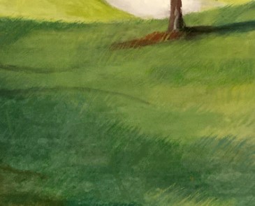
After the initial sketch I took the work home to get into coloring in pastel. The picture you see below is where pastel work stopped and the rest of the work in Procreate began.
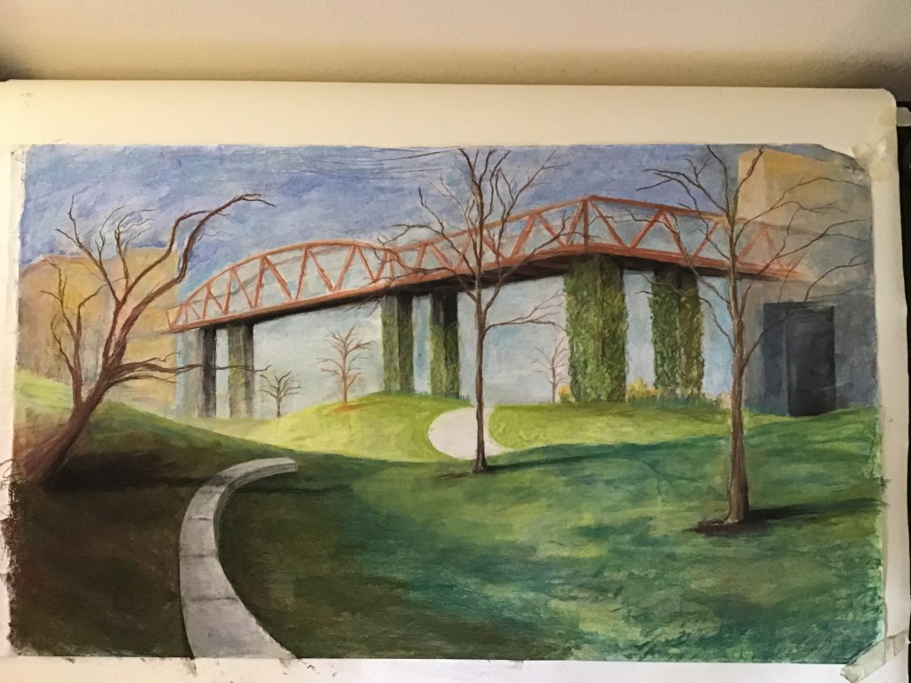
At this point, I stepped away from the drawing for a couple of weeks (a bit longer than usual) and came back with “fresh eyes”.
To any artist reading this, do step away from your work from time to time. Every work needs some room to marinate, and this only happens when you don’t babysit it.
When you return, take stock of what parts of the drawing are a success. You want to know what works, just as much as you want to know what doesn’t. Everyone knows to look for failures, but you have to balance this with the ability to notice successes. In order to remain constructive, I find I must remain open to seeing the positives and the negatives.
After I account for what is working and what is not, I hone in on fixing problem areas.
Problem Areas
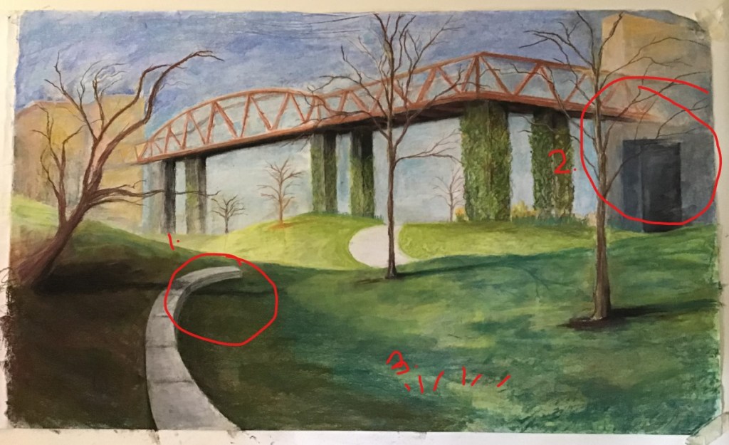
Problem area 1:
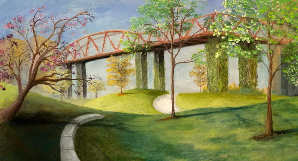
You can see where I have circled below (marked with a 1.) that I wasn’t sure what to do with that cement bench. It was a little to shallow, and looked more like a raised sidewalk than a bench. On top of this, the perspective was slightly off. This bench was a problem area.
Problem Area 2:
The second problem area is the door in the background under the bridge which just, simply put, was not fully resolved yet. You can tell I was not quite sure what direction to I wanted to go in back there, and for the most part this area is still just blocked in. This is one of those problem areas that immediately jumps out at me. This jumps out as much as it does mostly because of the contrast in value of that area. So, I knew I needed some resolve there.
Problem Area 3:
The grass, in terms of color, looks fine. It is how I intended and has a nice sweeping effect to it. The problem is that it lacks volume. It is unrealistically flat, leaving these large open spaces feeling lifeless and uninteresting.
Resolutions
It was the problem areas themselves that made me feel digital was a good idea. This is a key point here. With new art technologies, the doors are open to how we want to approach a work of art. So, having digital fluency just allows for a more dynamic approach to visual problem solving.
With layers, the color picker, and the various other tools available digitally, making edits like this is simplified.
One last point, before moving on: Take some time to capture a high resolution, well lit image of the work. It will save you time in the long run.
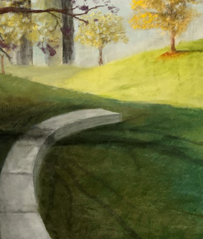
Resolution 1:
I raised the cement bench and painted in a more accurate perspective.
I also improved upon the shadows under this tree, and all other trees for that matter. This was important here just to add some visual interest to that part of the image
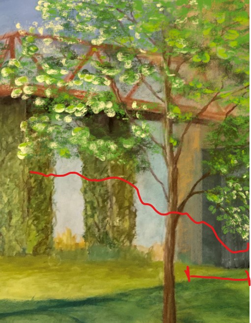
Resolution 2:
I marked below how I re-framed the entire image to better frame the subject and reduce the chance the viewer will be distracted by background detail.
Cutting this door in half and covering it with leaves from the tree in the foreground was the right approach to solving this issue.
Resolution 3:
I improved the grass by drawing in individual grass blades. I would typically not take this approach to grass but the grass was close to the “camera” and the level of detail throughout the image is high. I went ahead and put in the time needed to keep the image cohesive.
So, again, here is the image after some final touches in Procreate.
Key Points
- In today’s art world, we may adjust from traditional to digital at any point throughout the process, there are no boundaries to your approach if you have cross-fluency.
- We have the luxury today of letting problem solving be our guide across traditional and digital mediums. Decide when and how to switch tools for a project based on the goals you have set for the project.
Thanks so much for taking a look and I hope you found this article useful. If you have any questions reach out to me via my contact page- I’d love to hear from you. Cheers!
Sincerely,
Arjuna Leri

Leave a comment