
Lead Design System Designer | @JumpCloud | 2024
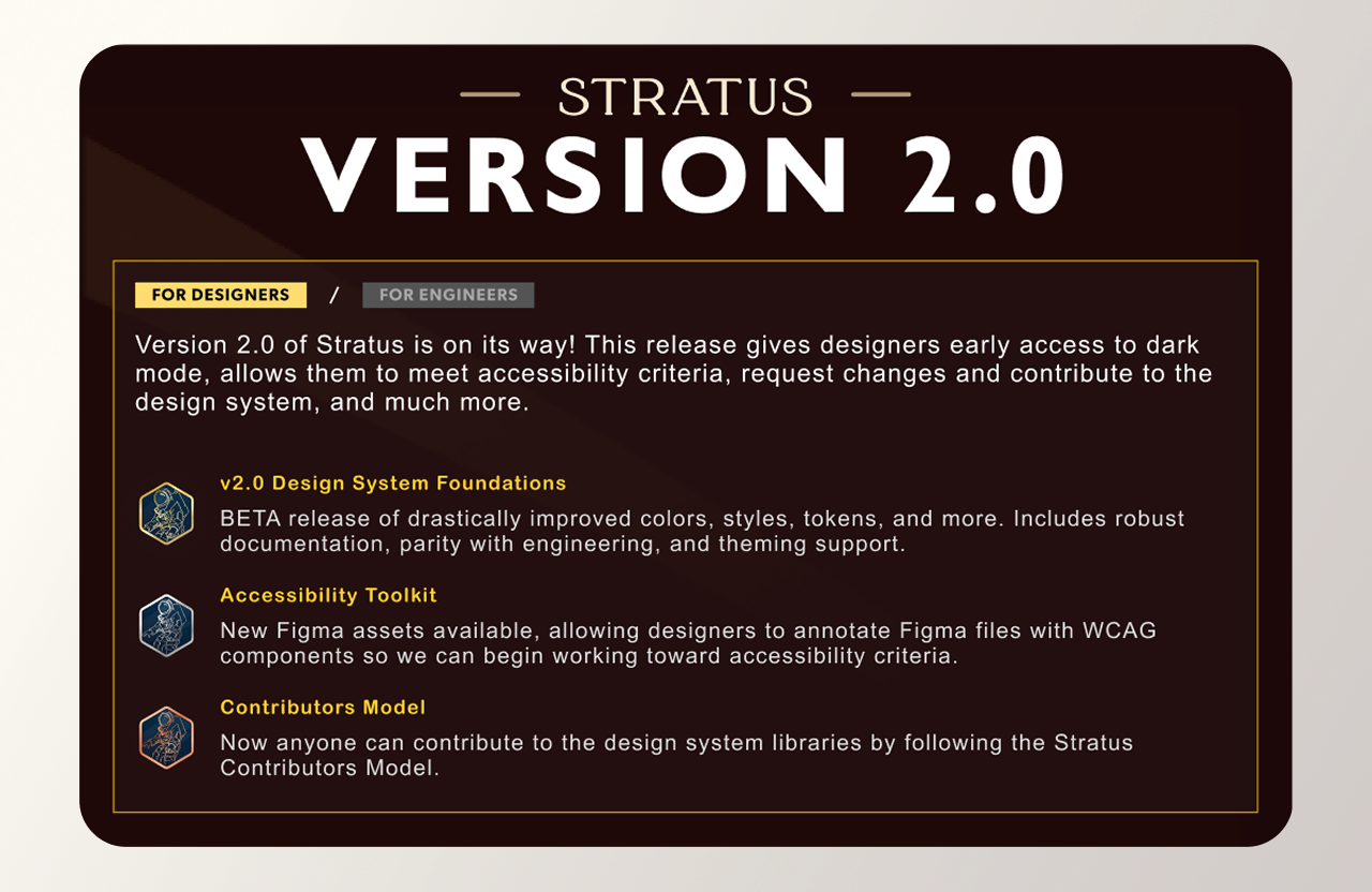
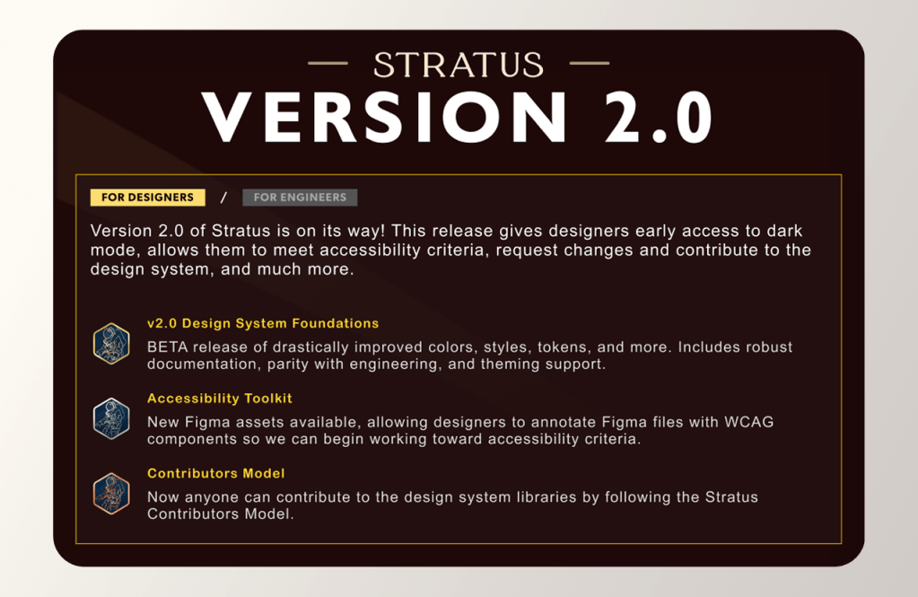
Stratus Design System v2
Leading clarity, inclusion, and scalability for the next version of the JumpCloud Design System.
ABOUT THE PROJECT
Version 1.0 of “Stratus” (the design system for JumpCloud) performed really well, reaching 100% design team adoption, and proving a need in the organization. After launch, JumpCloud almost tripled its employee count. While V1 held up well, it had some trouble scaling with its growing user base. In order to enable system evolution and adequate PEX tooling, I became the Lead Product & Design System designer of Stratus.
This project focuses on v2.0. This version proposed an evolution of Stratus, innovating on infrastructure, assets, and resources to enable clarity, inclusion, and scalability.
MY ROLE
Responsible for leading all design system efforts in partnership with UX Engineering. Guided and executed research, designs, and socialization. Ongoing developer support/partnership. Contributed to agile workflow, presenting to stakeholders, and organizational education.
TEAM DETAILS
Platform Experience Team: Lead Design System & Product Designer (Me) Product Manager (various), Front End Engineering (Sean F.), Backend Engineering (various), SCRUM Master (Me & Sean)
Collaborations with Engineering/Product Leadership. Organized and managed Design System channels & guilds.
CONTEXT
What is the “Stratus” Design System?
First launched in ~2022, its a set of interconnected assets utilized by designers, engineers, and product managers to allow independent teams throughout JumpCloud to make better products faster.
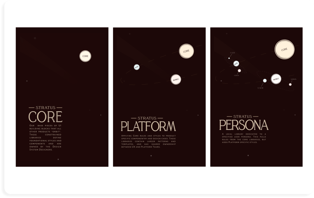
The system contains:
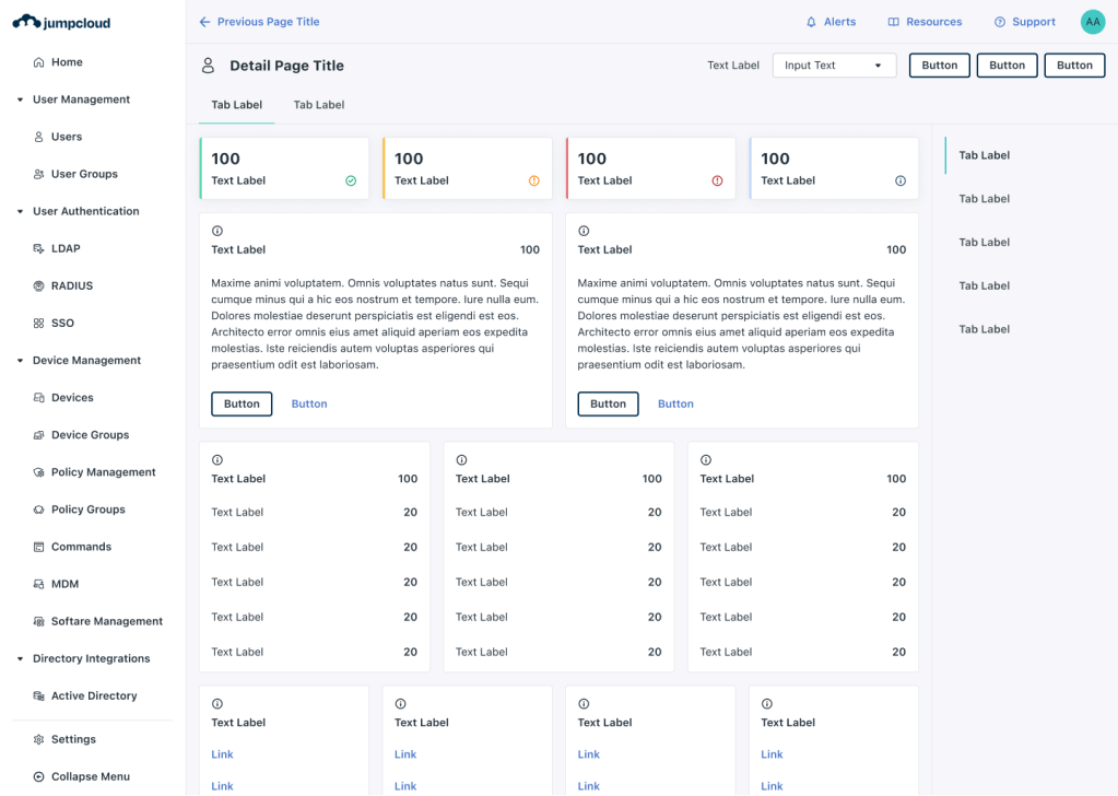
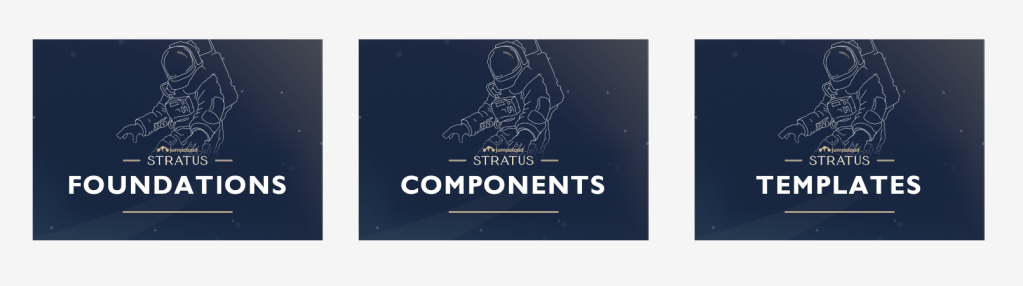
⚛️ Core Parts: These are base building blocks for JumpCloud experiences all products implement with. Repositories in Figma and Code containing foundations, components, and some templates, are distributed across the product org, but are managed (owned) by the core design system team (that’s me and my team).
🧫Platform parts: These are larger templates and patterns- built from the core parts- that define the UX/UI of specific platforms, apps, or experiences. Templates and patterns are often a distributed effort. In the case of this system, the core team and larger product org shared ownership of platform parts in order to enable innovative experiences in our products.
We measured the design system relentlessly, but here are a few KPIs:
✅Usage
Thousands of asset searches and usages daily (Figma side). Primary asset to all engineering and design workflows with dedicated repositories. All new prod hires are trained in the system.
✅Adoption
100% designer adoption across all new product initiatives. Growing adoption across all current JumpCloud products, reaching as high as 90% adoption. Ongoing training, guilds, and office hours.
✅Inclusion
Improves out of the box responsiveness, keyboard navigation, and UI labeling. Improves contrast accessibility. Improves consistency of styling throughout the UI.

PROJECT GOAL
Lead the optimization of Stratus to enable product led growth.
MIXED METHODS DISCOVERY
Prioritizing deliverables via research.

1️⃣ Method: Audit v1.0
Audited every asset to identify size and priority of work needed:
- Introduced a system reliance metric to quantify an element’s importance within the larger system.
- Conducted individual element audits, conducting user interviews, digging into bug tickets, reviewing old jira cards, and mapping found issues to corresponding elements.
- Measured design and developer confidence, on a 1-7 scale, in each element across multiple categories like “build confidence” and “documentation confidence”.
2️⃣ Method: Affinity Diagram
Informed Affinity Mapping to establish project & Design System principles:
- Invited collaborators from across the organization to contribute their answers to a set of predetermined questions.
- Conducted a remote 45 minute workshop utilizing Miro to gather stakeholder, user, and collaborator insights in writing and through discussion.
- Reviewed responses to establish similarity in insights that suggest categorical relationships to distill into Stratus principles.
3️⃣ Method: Prototyping & Proof-of-Concepts
Established project deliverables through des>dev prototypes
Based on the audit, our principles, and open bug tickets, UX Engineering and I “chunked” work together and began building proof-of-concept solutions to drive details of project deliverables.
DISCOVERY OUTCOMES
3 guiding principles
“Scalable“
So we can grow without rebuilding.
“Clear“
Clarity in usage, documentation, and build.
“Inclusive“
System is responsive, accessible, contributable, made for all.
A project roadmap.
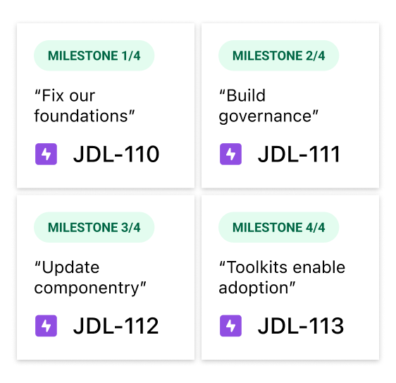
DESIGN PHASE MILESTONE 1: FIX OUR FOUNDATIONS
Fixing Colors & Tokens in Stratus Foundations.
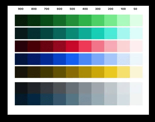
1️⃣ Design: Accessible Color Palette
Color palette that enabled modes, contrast, & usage:
- Simplified color steps, ramps, and maintenance.
- Enabled contrast accessible design
- Optimizes color for modes (light and dark).
Result
✅ Guaranteed contrast accessibility when applied according to guidance.
✅ 1 unified palette for all products.
✅ Clarity of use.
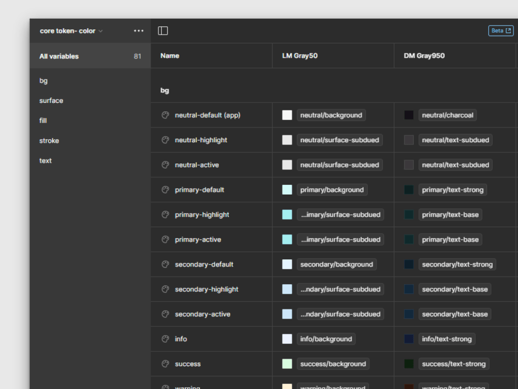
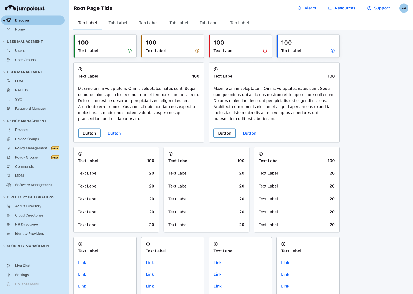
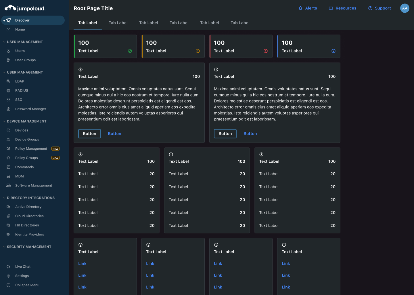
2️⃣ Design: Token Integration
Partnership with engineering to create a des>dev bridge:
- All tokens built in Figma Variables, using modes and a unified naming convention.
- Systematic review with engineering to ensure alignment and parity.
- Built with tailwindCSS then documented in Github Pages.
Result
✅All design system resources are available in all color modes and sizes with click of a button.
✅1:1 Parity with engineering in our foundations, resolving a mountain of tech debt.
DESIGN PHASE MILESTONE 2: BUILD GOVERNANCE
Benchmarking so we can update thoughtfully.
1️⃣ Design: Benchmarking Resources
1 Benchmarked source of truth
- Enabled others to contribute by creating a “Stratus contribution model”.
- Establish a versioned source of truth with ownership, JIRA, guilds, and a roadmap.
Result
✅ Libraries have permissions, tracking, & approvals, but anyone can help us build.
✅ Increased collaboration between dev and design.
2️⃣ Design: Robust Documentation
Establish one source of truth:
- Wrote dozens of pages of deep documentation of all decisions made in foundations. Even though I knew it would be “skimmed” by users, it was important to establish knowledge.
- Linked that documentation to engineering side.
Result
✅ Enabled further contribution.
✅ Aligned teams around common foundations.
✅ Simplified socialization & presentation.

PROJECT OUTCOMES
A renewed approach to scaleable product growth at JumpCloud.
More visual clarity throughout the UI, across platforms, with our fixed foundations.
- Shipped new foundational elements have been reframed into a clear, scalable, and accessible framework.
- Shipped dozens of internal tooling updates that increased des>dev efficiency
- Contrast passing UI improved visual hierarchy and accessibility
- Introduced TailwindCSS for faster development
- accomplished des to dev parity
- reduced tech debt in foundations by 50%
Why?
- build the brand into the UI consistently
- foundational misalignment slows teams down
- engineering parity (more efficient)
- keep tech debt low
The introduction of dark mode into the system.
- Modernized approach to tokens enabled modes across our platform
- 2 built in modes, ability to white label out of the box.
Why?
- customer sentiment about outdated UI indicated room for growth.
- A segment of customers found our UI to be “too bright”.
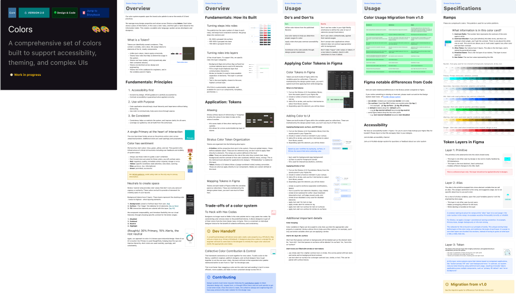
Robust documentation for all design system foundations
- Set the standard for documentation moving forward.
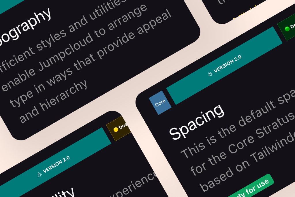
- Color, Typography, size, spacing, etc. all have overview, usage, and specs fully documented.
- A single source for all to refer to.
Why?
- counteract start-up stage “redeciding” that sometimes happens do to lack of context
- clarity of direction
Ongoing version updates, socialized a-synchronously.
- created a-sync tools for tracking tickets, bugs, and suggestions.
- created infrastructure for updates that we called versions
Why?
This is critical in ongoing maintenance efforts. Users needed flexible ways to continue learning the system as it evolves. If they wanted to contribute, we needed a way to track and test that contribution. Versions and other resources created an infrastructure for that work.
More Reading: the case study for my WCAG Toolkit
Beyond building contrast accessible palettes and color tokens, organizations need help understanding and adopting WCAG guidance. This is why toolkits published within organizations and more broadly are critical!
 Arjuna Leri