From idea to fledgling NPO, building a brand and website with founders from the ground up.
Transforming founder visions into a wonderful Non-Profit Organization, I teamed up with 3 co-founders to go from brand inception to a dynamic online presence. Collaborating closely throughout, we crafted a compelling brand identity and integrated it into a user-centric website. From ideation to reaching business outcomes, this comprehensive design journey helped realize a flourishing community-driven venture.
Deliverables
For this project, I set up a “design as a service” workflow, delivering 30+ design and development tasks in under 72 hours.
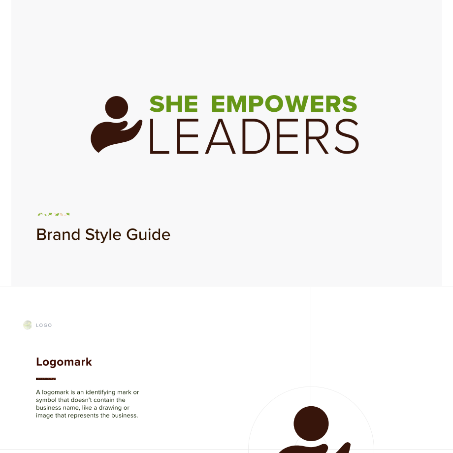
Designed the company logo, roughly 30 page brand kit including imagery, content, logo, color, and typography with do’s and don’ts. Developed WordPress website of 12+ pages.
Role
Freelance Full Service Designer & Web Developer. (Brand Designer, Web Designer, Graphic Designer, Web Developer, WordPress Developer)
Teams
Solo designer serving a team of 3 co-founders
Duration
6 Months, completed Jan 2024
Tools & Methods
Mindmaps, Discovery sessions, Stakeholder interviews, competitive analysis, Design workshops, Figma, Trello, Design System, Remote Work
Discover & Establish Foundations
In the project’s early stages, we explored the founders’ vision. I chose a holistic role as not only consultant or designer, but as a teammate on a journey. This close collaboration revealed their character, deeply informing how I envisioned the assets I would deliver.
Key Design Steps:
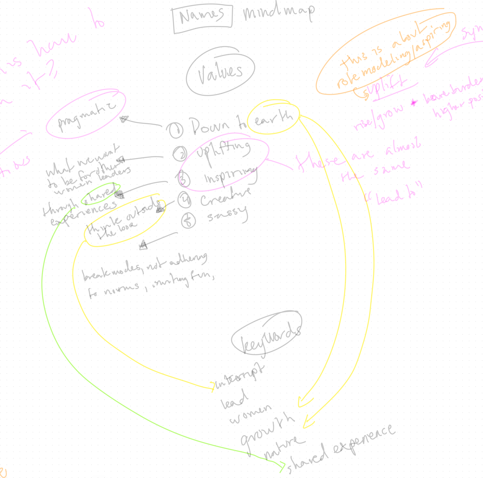
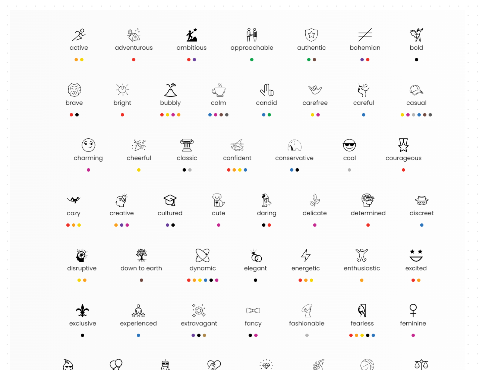
- Explore Vision, Mission, and Values: Guided founders through discovery techniques including a semantic differential exercise (word preference) to clarify their vision, mission, and values.
- Created a Mind Map: Synthesized findings into a mind map to inform naming and brand strategy.
- Developed Brand Direction: Proposed an approach to brand principles that provides a cohesive identity, including typography, color, imagery, and more.
- Designed Early Concepts: Crafted broad, early-stage designs to connect discovery insights to a visual language. The key here was to get creative and explore broadly.
- Aligned Team Goals: Outlined project scope, milestones, and timelines to align the team and ensure clarity of deliverables and direction. This would allow us to converge on an identity.
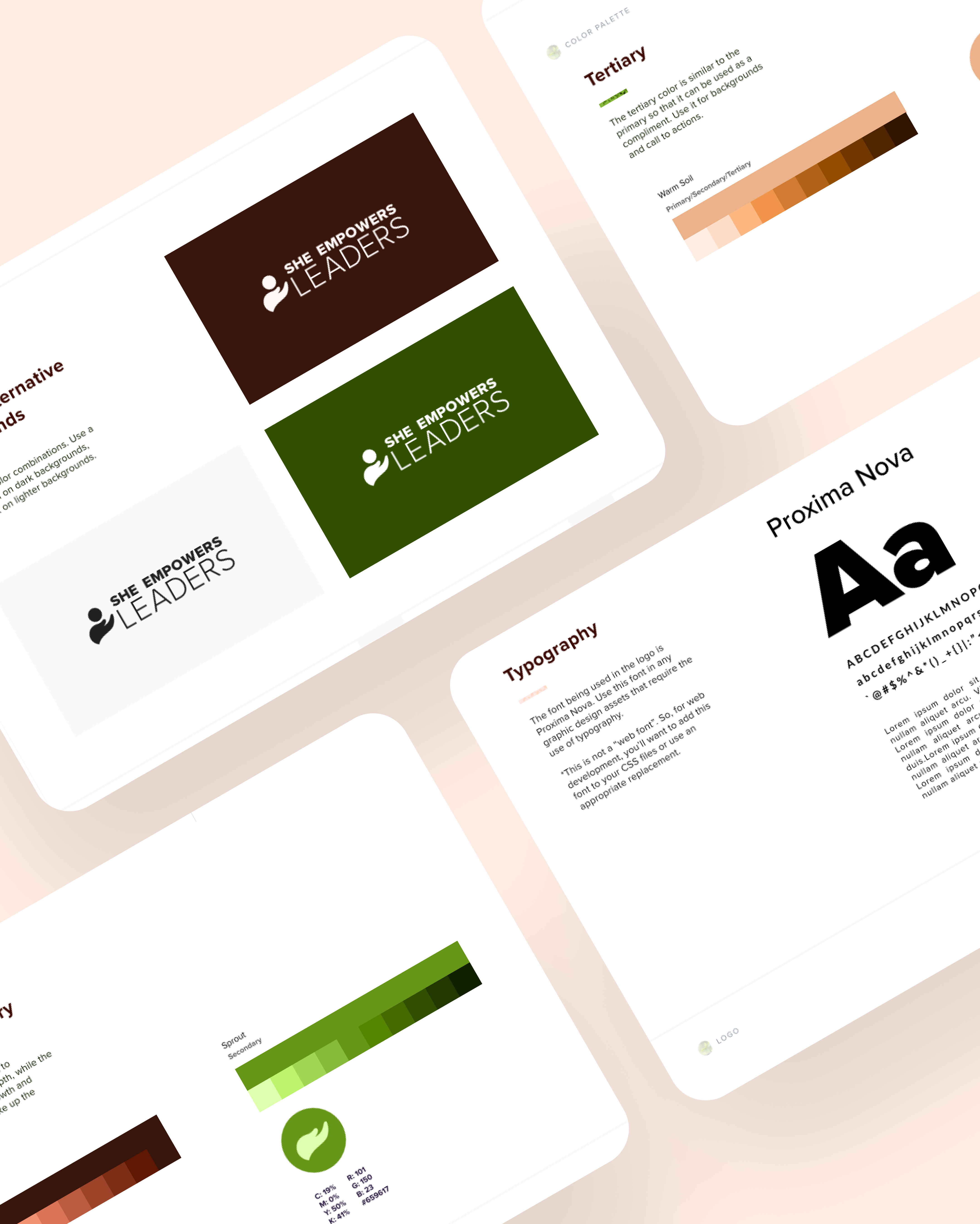
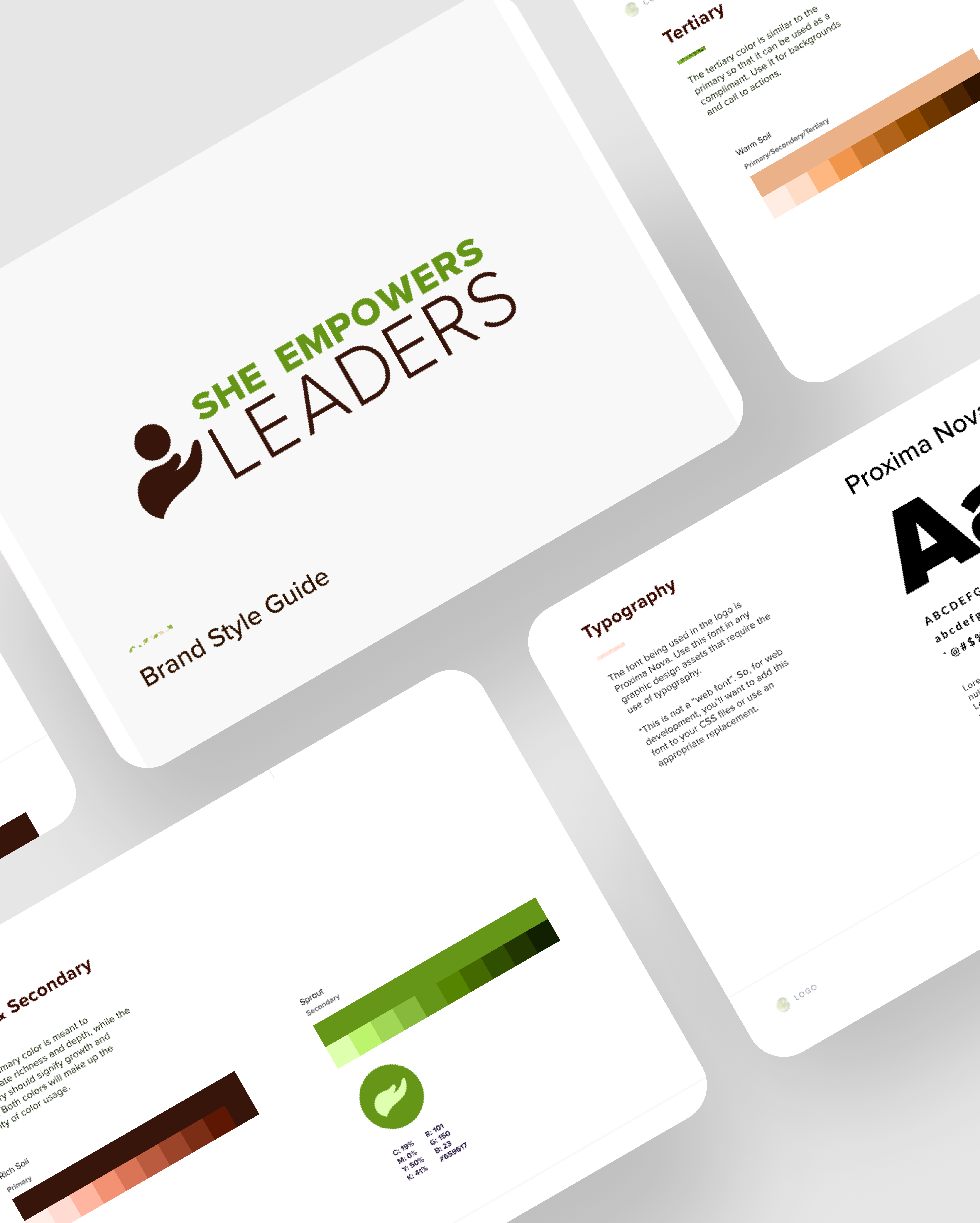
Defining the identity as it emerges
This phase focused on translating the founders’ vision into tangible brand elements.
✅ Deliverables:
- Custom combination logo & wordmark
- Functional alternative logo compositions
- Type kit and typography system with documentation
- Color kit and color system built in to Figma with documentation (A11Y Accessible)
- 15 pages (.pdf) of easy to follow brand guidance, including do’s/don’ts, to help standardize aesthetic decisions.

” Every task delivered for review within a 72-hour deadline 💨! “
Develop: Rapid Implementation
Execution of the aesthetic into the business’ own little corner of the internet. We moved Figma wireframes and WordPress builds quickly through acceptance by establishing an asynchronous Trello workflow. Each page was wireframed and passed on for review. If it passed review, I built the page in WordPress.
✅Key Deliverables:
- Custom design system, built based on brand, to speed up transition from low to high fidelity.
- Focused on building an clear and beautiful marketing website with a simple, user-centric experience and UI tied directly to the branding.
- Finalized dozens of design and build tasks over the span of the project, almost always asynchronously.
- Every task delivered for review within a 72-hour deadline 💨!

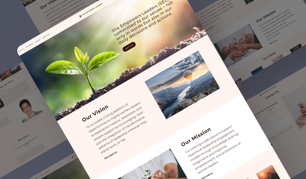
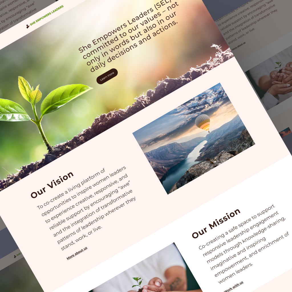
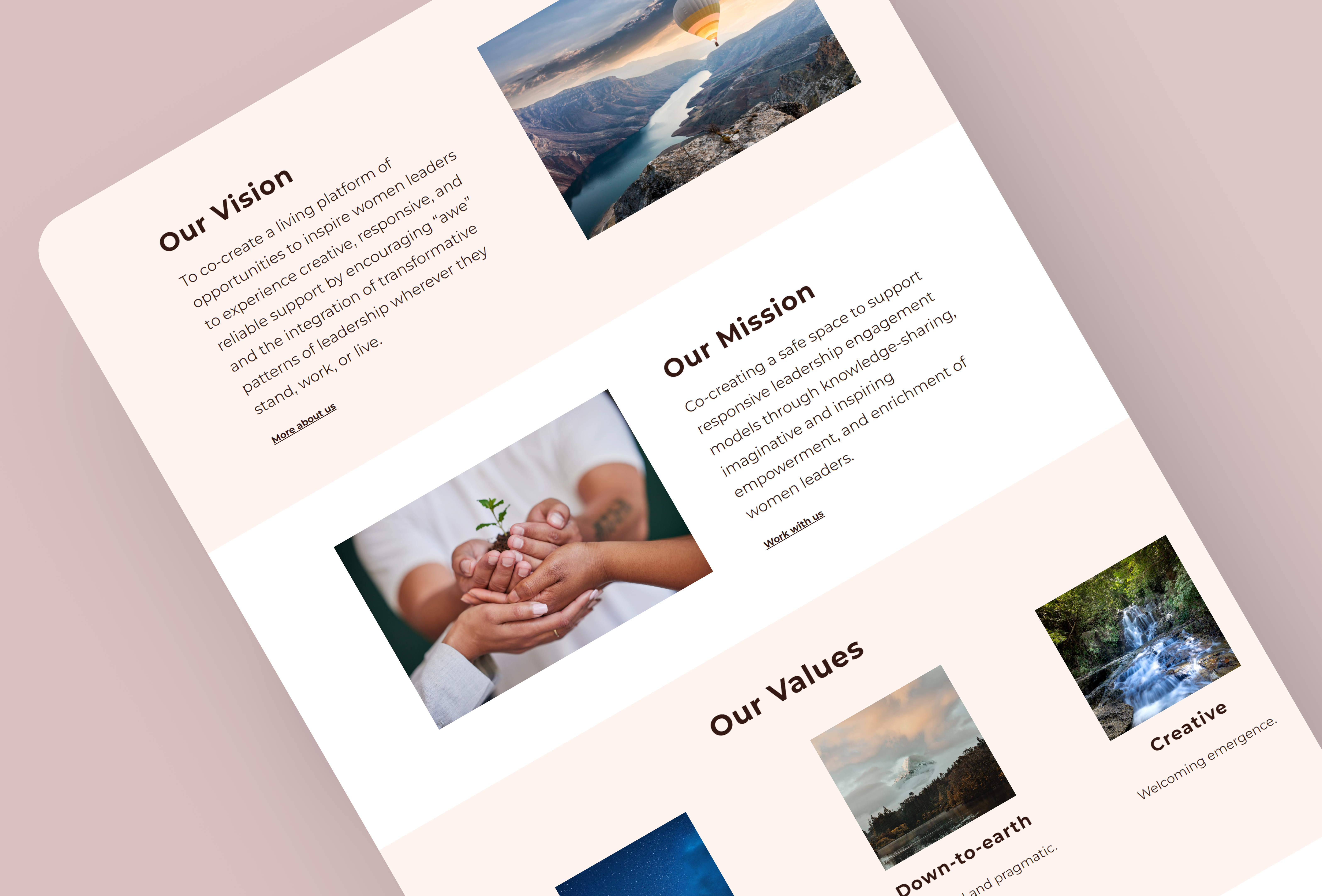
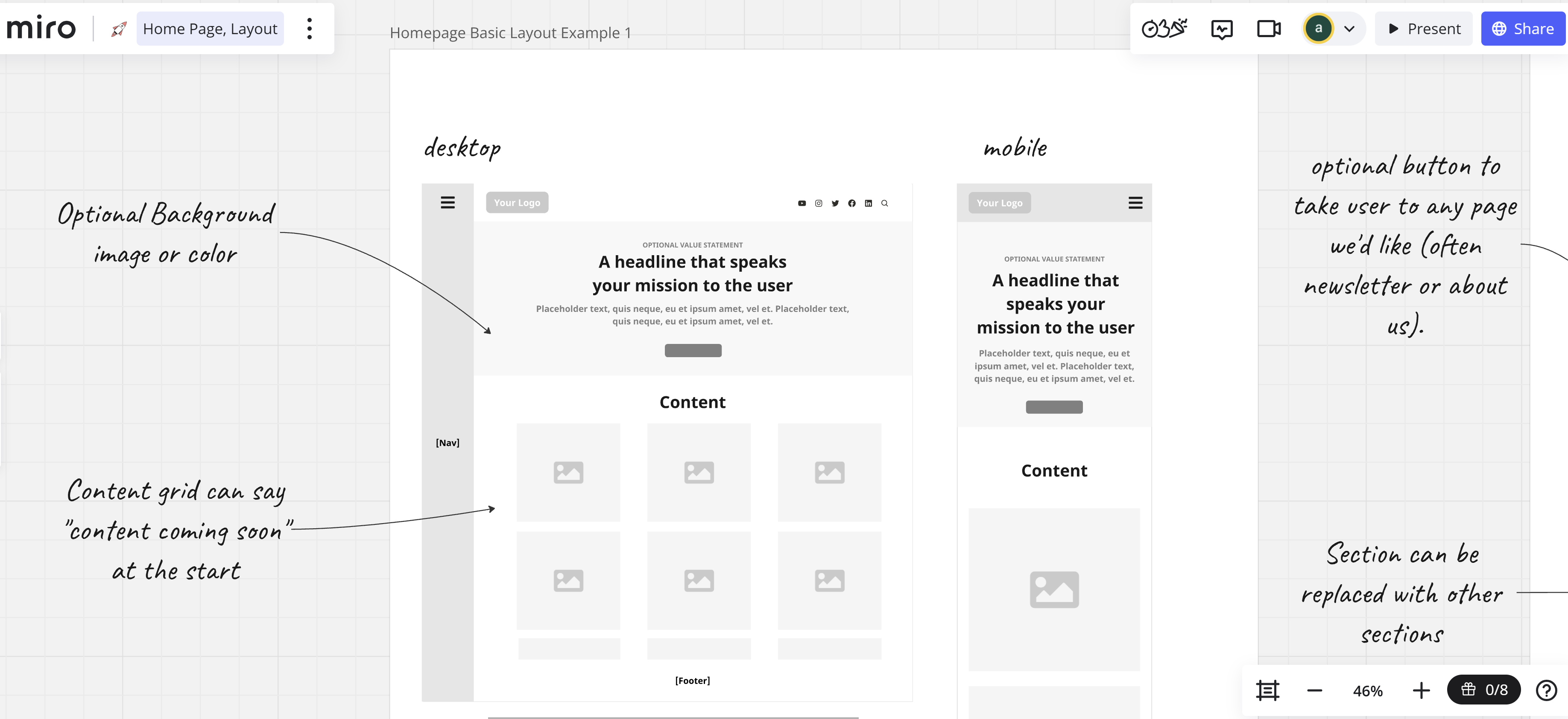
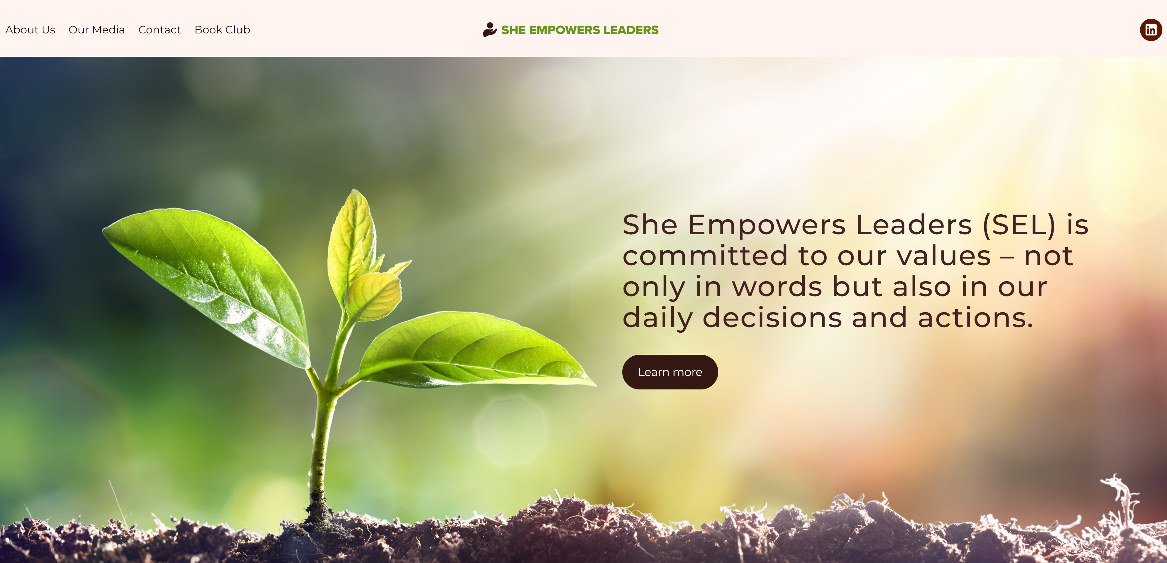
The Homepage: A deeper look at our process
The image below depicts a middle step in the larger process we used to bring our ideas to reality. On the left, you can see instructions I provided to the reviewers to enable a-synchronous review. The artboards on the right are my proposals for the layout of the page in question.
What was important here was to allow them to not only choose the layout they prefer, but bring closer to the way the final website is actually being designed and built. The examples portray how pages are made up of patterns, and patterns made up of blocks.
This is important because the patterns and blocks are like Lego pieces, they are interchangeable parts, and knowing this allows for us to toss ideas around with clearer understanding of concepts.

Step One: Research 🔍
Some pages required more research, while others were just a quick email. Most research methods used were attitudinal, including concept testing, card sorting, and various forms of stakeholder review.
Step Two: Propose in low-fidelity ✅
(Above) Here, the stakeholder attitudes and perspectives were collected by proposing the convergence of a solution. Often providing 2-3 options, I would gather this critical feedback before tackling a higher fidelity design.
Step Three: Map to high-fidelity 🎨
I was able to lightspeed through step 3 due to the previous phase. The same blocks and patterns from the low-fis were previously made in Figma as my own design system. Hence, this step was just a process of auto-layout arrangement, often with minor alterations, in Figma.

Step One Example: Exploring similar websites
For the Homepage, we started with explorations of layout through examples of similar websites. I conducted a review session where I discussed how these websites break down into blocks, sections, and pages. I think through a modern Atomic Design model but communicate in understandable language.
Step Two Example: Low-fi proposals
I present 3 options here, with thoughtful instructions to start, and notes in the margins throughout to guide the review. They review a-sync, and recollect via email where our mutual thoughts are documented and collaborative. All of this gets captured in our Trello workflow for ease of access and recording.

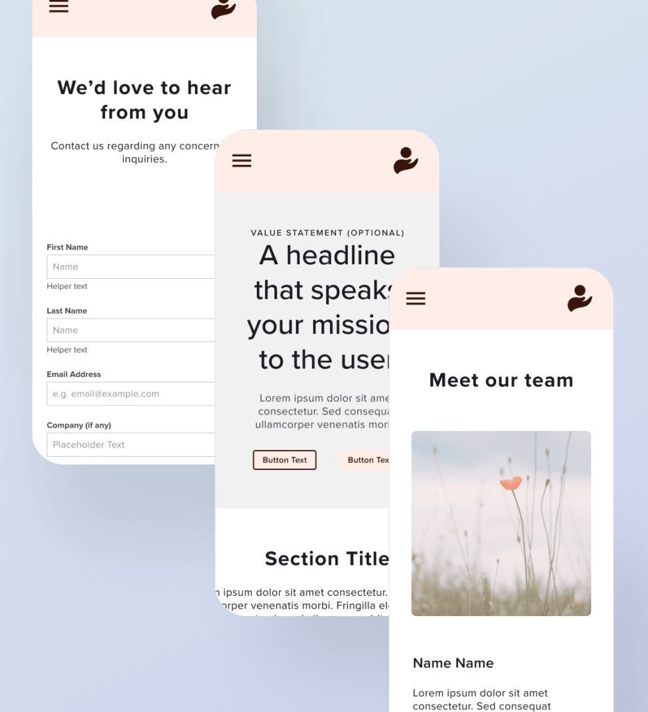
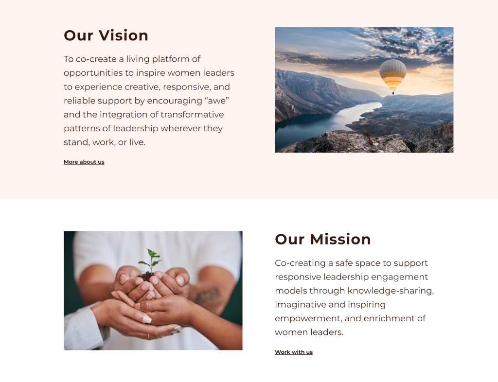
Step Three Example: Final Design
We landed on a version of layout 1, with a splash image and a content grid below. You can see how close the low-fi is to the final, though in this case the content grid turned into side by sides to present beautiful imagery next to our vision and mission statements. The important thing is that comms don’t have gaps from idea to completion, and this process helps achieve that.
Delivering idea to impact
What did the project accomplish?
Operational NPO: This work materialized an idea into an operational Non-Profit Organization focused on empowering the next generation of women leaders.
Brand Impact: Adopted across 100% of digital & physical marketing materials, it has helped the organization establish an initial audience.
Website Functionality: Successfully hosted the organizations first public event, attracting a small but meaningful group of over 20 participants 😊.
What did the clients say?

Dr. Zelma
She Empowers Leaders Co-Founder
“It was a joy and gift to have had the opportunity to work with Arjuna and to get to know him…”
Mary Kay
She Empowers Leaders Co-Founder
“This is truly art. You are an artist.”
More Reading: Product design case study, making login easy.
A study of the process behind a cross-functional and platform wide project to improve the standard of the Login experience for a B2B mid-size startup in the IT space.