Product Design | B2B2C SaaS | Customer Experience | 2022
Platform-wide Login Redesign, Making Login Easy
Upgrading our platform’s login designs to improve security & streamline interactions.

ABOUT THE PROJECT
I was tasked with upgrading our platform’s login experience to improve security, streamline interactions, and update the experience to match our design system. Login is a first point of impact, and not only needs deep security considerations, it also needs to be easy for the user while making a good impression.
MY ROLE
Responsible for end-to-end UX/UI. Contributing and leading user flows, competitive analysis, wireframes, prototyping, and final designs.
TEAM DETAILS
Security, Authentication, Customer Experience

PROJECT GOALS
These goals became metrics we achieved as a result of our work:
Reduce
time on task for all login workflows.
>10%
less pages in the common path while maintaining high security standards.
100%
Design system alignment.
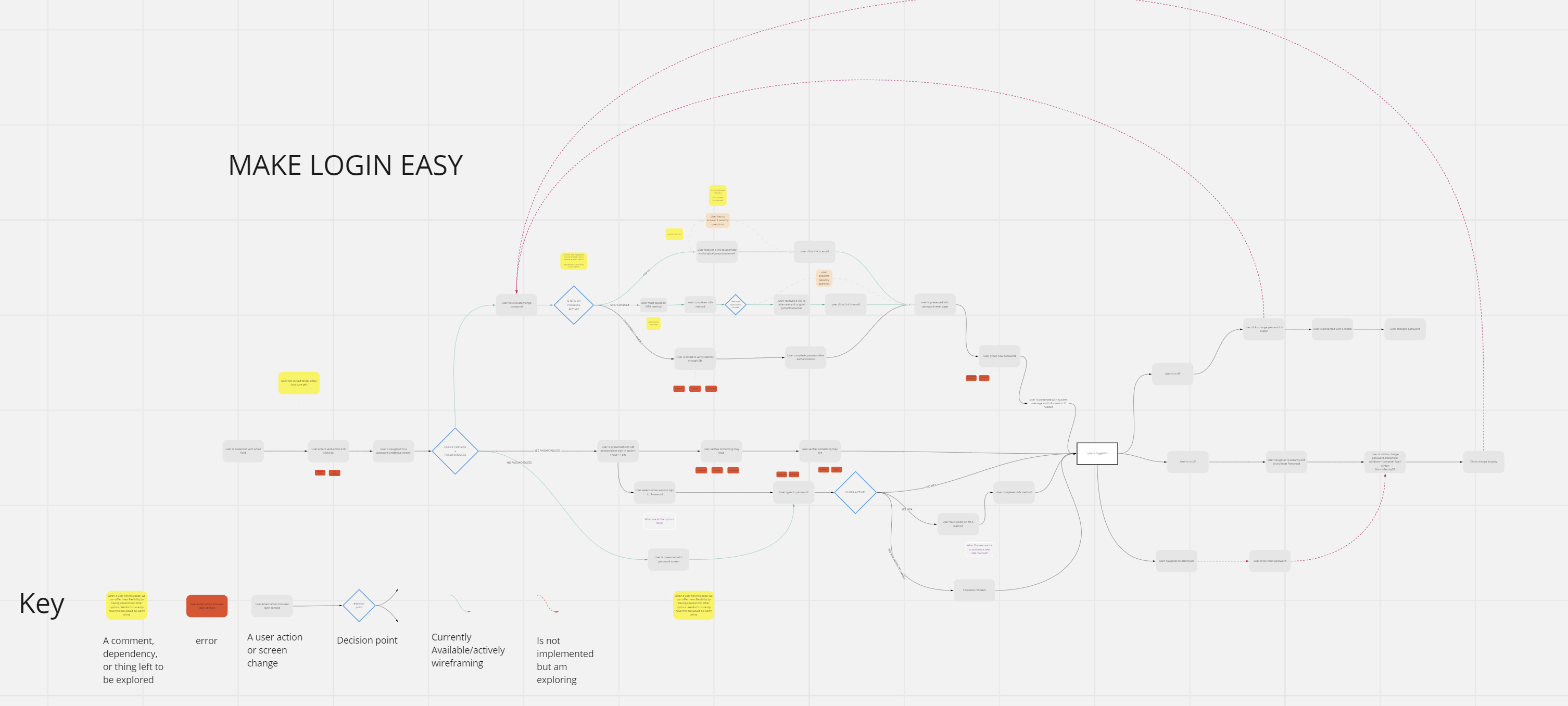
USING FLOWCHARTS
Creating a source of truth for recording entry points, security constraints, features, future plans, and paths through the experience.
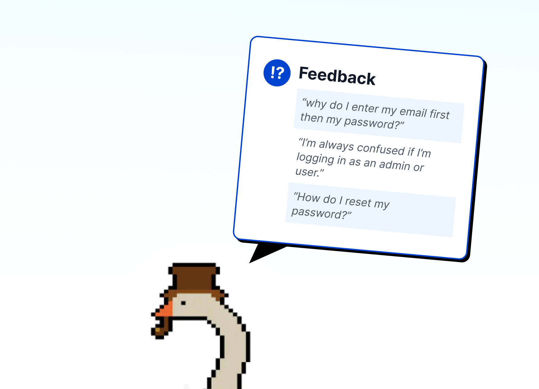
Login needed to be broadly approachable while respecting security constraints. I teamed up with security & authentication teams to define hard requirements for the final designs. In order to uncover that knowledge, I needed a single source to document findings. Working with collaborators weekly, I captured the all login paths in one flowchart.
Why this was helpful:
Blueprint for team
Mapped every interaction in the login process across all products. These served as living documents, guiding the team through the project lifecycle.
Alignment on priorities
Identified key opportunities to improve security, streamline interactions, and unify the experience with the organization’s design system.
Defined project goals
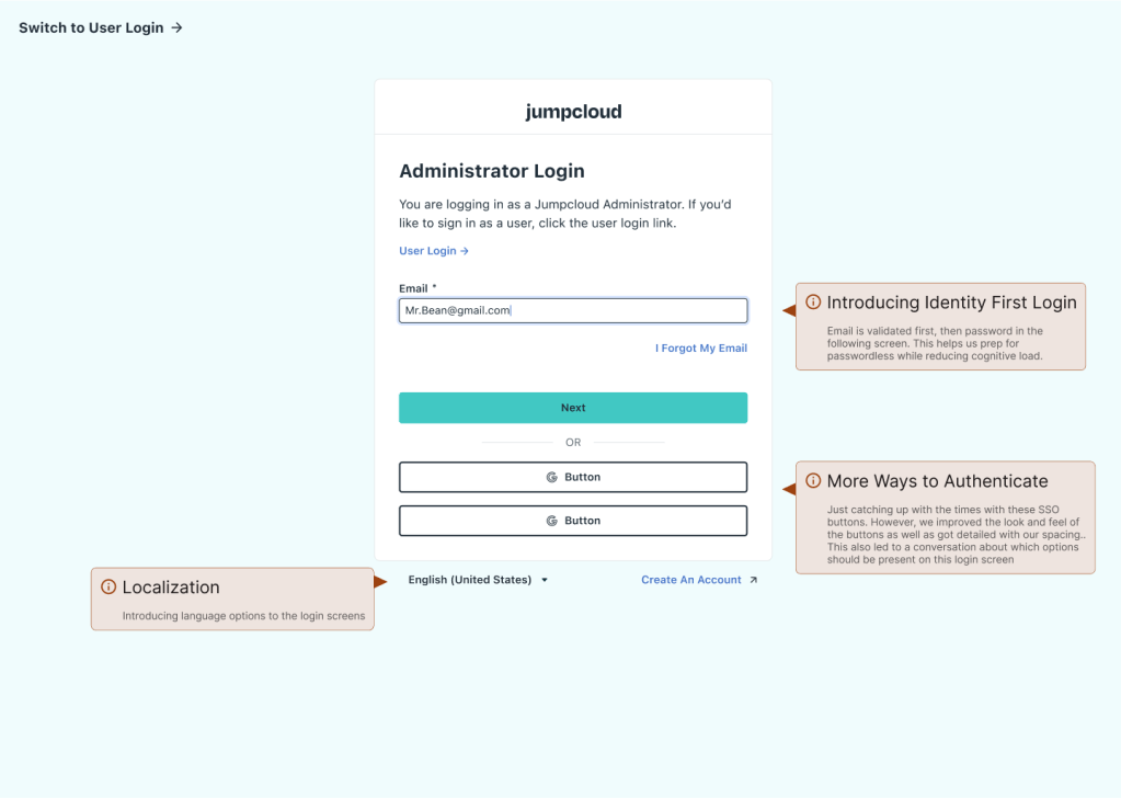
- Introduce an “Identity First Login” to modernize architecture.
- Reduce the time required for login & password resets.
- Align UI with the v1.0 of design system
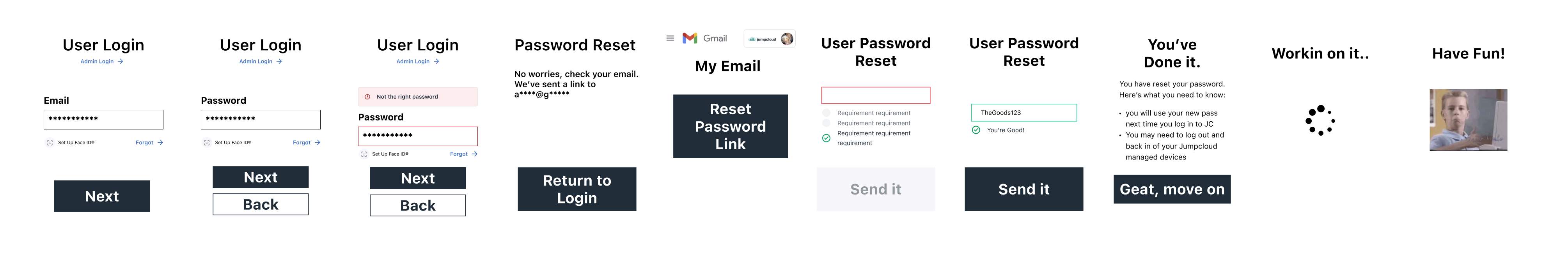
DESIGNING IN LOW-FIDELITY
Why and how do I use lo-fi?
For me, low-fidelity is more of a storytelling and discovery tool, less a part of the design phase. With today’s atomic design approach, roughing out a page layout (even in gray boxes) often requires considering molecules and organisms. I find that can get me wrapped up in layout and componentry, instead of flow and ux. So, instead of static wireframes, I keyframe the user journey, sketching essential elements to highlight movement, choices, and action.
✅ Less confusion on fidelity.
It is truly low fidelity, and people generally get that. In my experience on this project and others, I get almost no confusion about where we are in the design process. I’m even more clear on where I am, and am able to alter these without being wasteful or disruptive to the project.
👍 Focuses the feedback.
I always prime the conversation of course, but having almost no true layout means nobody comments on it. They keep the main thing the main thing and make sure at a high level the journey, and choices, are worked out. Designers often need this to move forward and that is really important.
⌛More efficient.
Efficient because I can directly translate a flowchart into these little caricatures of a step in the flow. I don’t have to worry about layout, alignment, color, etc. so I can move faster. Further, I can make these presentable, even humorous, garnering more engagement, leading to more feedback!
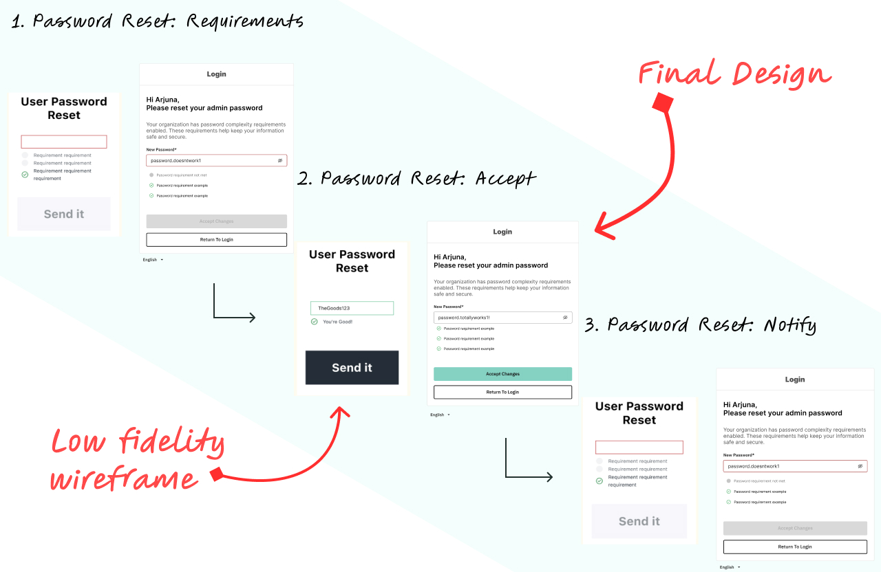
DESIGNING HIGH FIDELITY
Translating flows and low-fis into high fidelity designs.
Mapping each click in the login flow revealed inefficiencies in our login experiences, but our complex flowchart overwhelmed many of our stakeholders. To drive progress, I translated it into low-fidelity wireframes (above).
That made the process more digestible and editable. This shift accelerated collaboration, allowing teams to check, refine, and ensure deeper security compliance in real-time.
After a few rounds of reviews and refinement, I was able to translate our low fidelity screens into componentized designs.
TESTING PROTOTYPES INTERNALLY
Garnering initial feedback from admins and experts within the organization.
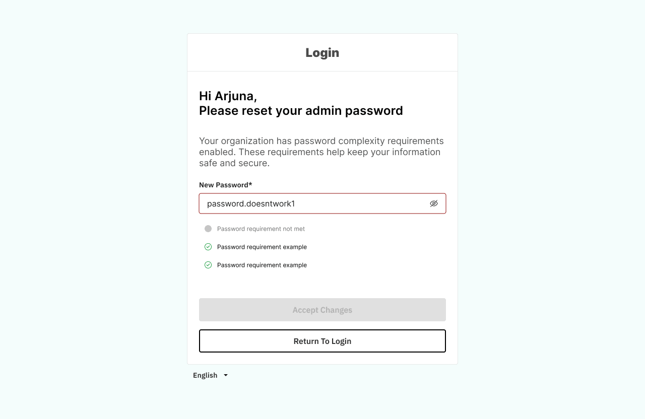
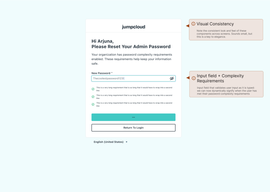
To enable internal testing of the login experience, I built a prototype of the login experience, and conducted user testing over the span of 2 weeks. Findings suggested small changes to visuals, and the addition of password complexity feedback when creating a new password.

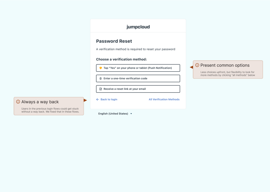
PROJECT OUTCOMES
New designs had measurable impact on the login experience.
Login is Measurably Easier
No less secure, but certainly more efficient. Reduced clicks and pages, introduced flexibility with SSO authentication options and localization (a stretch goal), and improved visual consistency. We introduces better feedback with improved inputs, show/hide password, and password complexity indicators for password reset.
Managing “Identity First”
Identity First login accepts the email input separately from the password. This introduced additional complexity to the project. Not just from design POV, but for engineers, leading to prioritization and sizing efforts that turned this project into a larger epic. I helped guide these exercises and oversaw engineering wherever I was needed.
Design System Integration
Everywhere possible, I utilized what was already present in the system. However, some components and templates for this project were improved and that helped us standardize, in turn speeding up other projects. Mobile components, icons like show/hide, and inputs were improved in code and design repositories.
More Reading: Design System Case Study
As one of the Design System founders, I stepped up to lead the next evolution: Version 2.0. This version prioritized scalability, clarity of application, and inclusivity for accessibility and broader team ownership.