
Helping Jumpcloud achieve scalable UI (and dark mode)
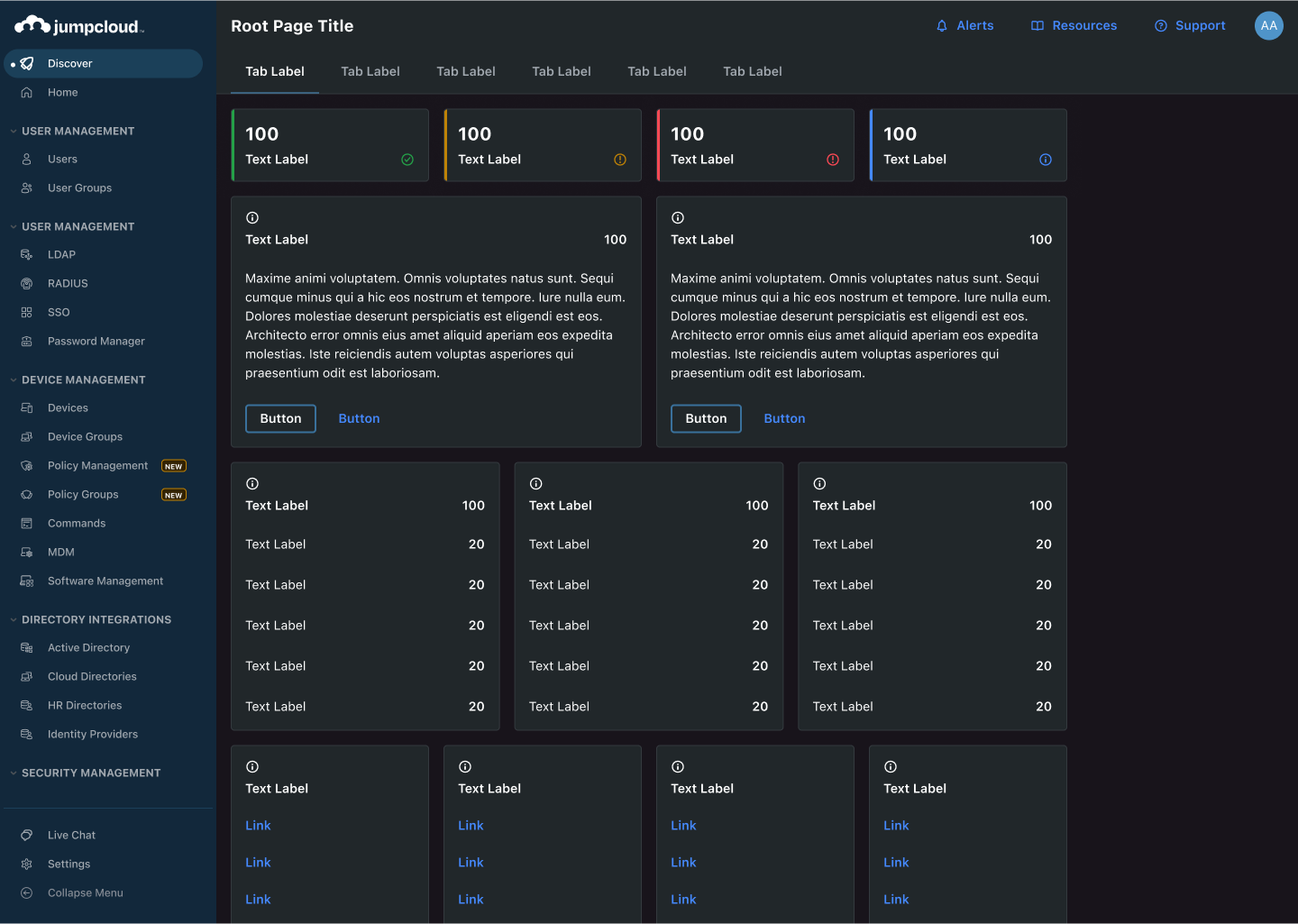
The people want dark mode!
📌 About
Jumpcloud’s growth happened quickly. This put pressure on the foundations of our UI. We suddenly outgrew our color framework, among other things, and someone had to make a case for an update to enable our engineering and design squad.
As a Stratus Design System founder, I led this evolution, emphasizing clarity, scalability and inclusion. This redesign marked a strategic move towards better partnership between product engineering & product design, as well as a step forward for user-centric design at Jumpcloud.
⚒️ METHODS
prototype to contextualize color decisions. These colors have to be viewed against each other due to color relativity. I also have to see various layout approaches to using color.
Accessibility Research to make a color system that looks modern and is built for everyone, it requires I build accessibility into the foundation of the project. at least AA color contrast for all components is the goal. Eventually 100% of the platform will pass color contrast checks.
Study the frameworks that enable our clarity, inclusion, and scalability needs. Deep dives into other popular products, reading docs and articles from IBM and folks like Nathan Curtis, and constantly attempting and reattempting to build a framework. I became the most knowledgeable color designer in our organization in order to get this project right (also, color is really neat, so I had a lot of fun. My 4 year degree in fine art didn’t teach me nearly as much about color as this project did.
Alignment with Stakeholders to enable that scalability. Engineering and design need to speak the same language, as we always saw. To enable this alignment, I documented everything into our design system for that clear single source of truth.
Alpha Testing & Ongoing Visual Critiques with designers and various internal Figma users that wanted to see the v2 color system in action. This was my chance to stress test this system, and be present to see how users absorb and apply this framework.
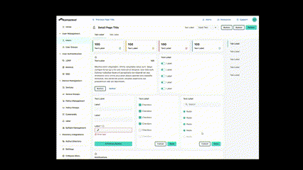
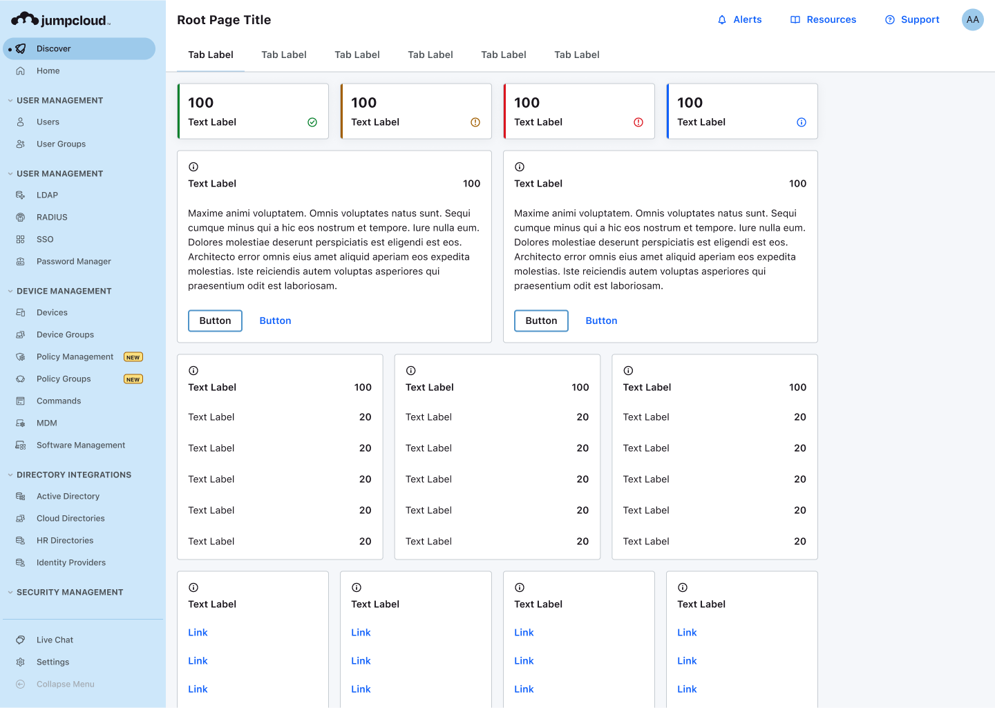
Sample
The switch from light to dark happens thanks to design tokens. Those tokens are a lot of work, and take a dedicated effort to sort out naming, usage, implementation, and how to make engineering tokens 1:1 with design. Dark mode would be incredibly expensive without this, so this effort is worth it.
Methods
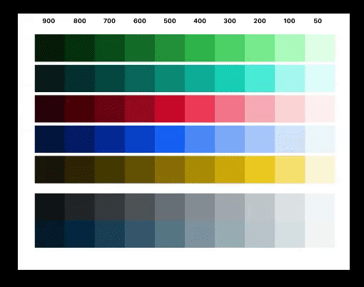
First, we needed to turn our previous palette into a color system. This process happened over time, and included a multi step project leading up to the ability to design dark mode. Before designing dark mode, our color system needed:
- Constrast optimization in the color palette so that each color of each ramp has a predictable greyscale value against white.
- Color roles and tokens to enable consistent color usage and implementation.
- Nested Token Layers with Primitives (HSL codes), Alias (non-specific ramp variables like blue200), and Token layer (usage specific color variables, named for use) to enable white-labeling, themes, and ease of use while remaining flexible at top layers.
- UI layers so that switching from light to dark is a matter of flipping layer by layer
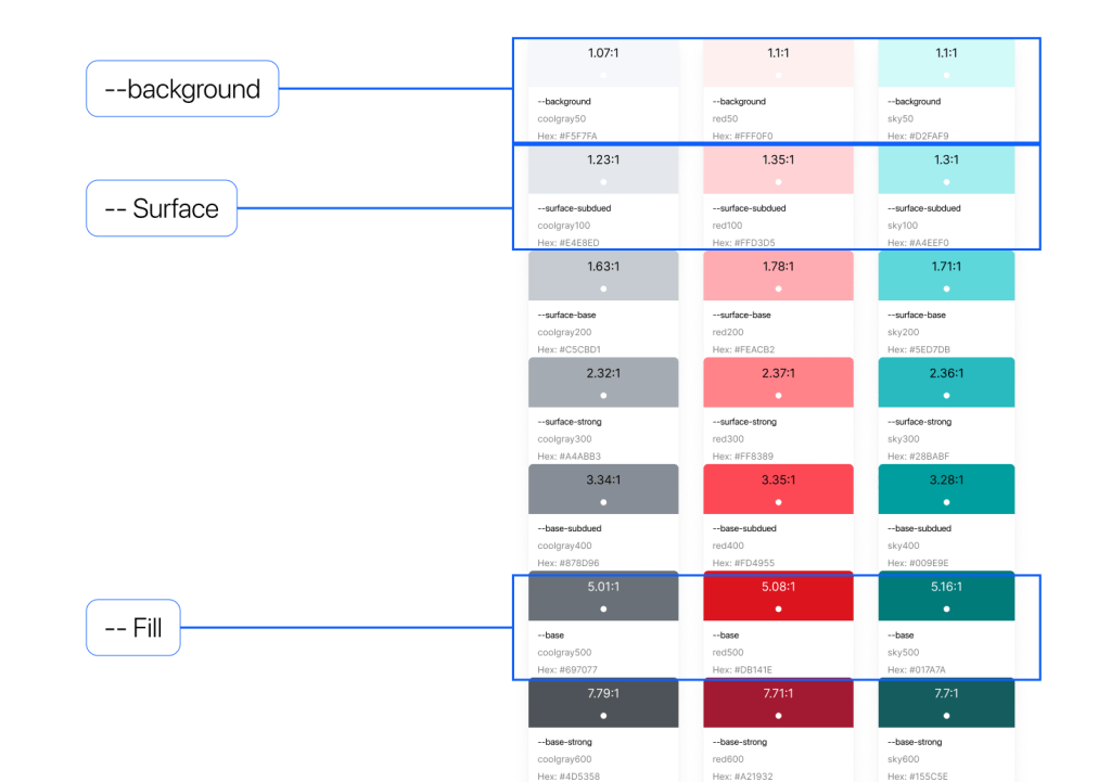
Contrast Optimized Color System allowed me to pick colors from the ramps and assign them roles. For example, across all ramps and all color roles, surface colors- which map to the 50s column- share an almost identical contrast against white. As you can see below, this concept is mastered across the entire palette.
Color Roles and tokens allowed for consistent and unified approach to color implementation in our UI. This is a matter of identifying colors that will play specific roles in the UI and then dialing in color through trial and error (lots of it).
Once you get this lookin’ good, you’ll be smiling ear to ear and well on your way to dark mode.
Creating layers for your UI is mostly a conceptual task. Once you get it, this whole process clicks.
There are many excellent design systems and articles out there that helped me work through this brain teaser. So, for me, it was a matter of understanding commonalities across many systems and identifying what works most frequently and then adapting that to the context of our product. For our system, it looks like this.
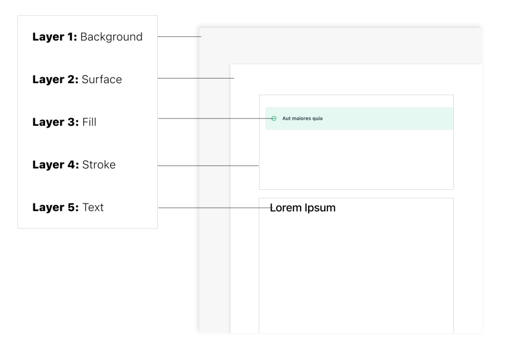
This conceptual understanding of how your elements layer on-top of each other will contextualize how to select and name your tokens.
Conclusion
The system touched down with such a robust and promising framework that Dark and Light mode is only a small piece of the benefits this change provides.
- Flexible enough to enable various design approaches to any component. Also, it can be applied relatively painlessly across any new product without having to make changes to the system
- Clear enough that designers in alpha testing consistently disagreed with the classic usability statement “this system is overly complex”. Clear enough for our documentation to only be half a dozen pages long 😁. Considering the complexity under the hood, that is not to bad!
- Inclusive enough that when designers use these color variables according to the naming conventions, the UI is 100% accessible in all modes. So excited about this!
Iterative Deployment
Today’s version of Jumpcloud products is continuing to slowly reach the point where these designs landed. Many lessons from earlier designs have informed the long-term vision of color for the companies platforms, but implementation for this project must happen in phases over time.
Try not to reinvent the wheel, but build for your specific context
This project requires a designer that is thoughtful, methodical, and frankly likes to read about methods and process. This is one of the heaviest trial and error projects I have ever done as a designer, because it is very complex and heady. Therefore, better not to boil the ocean or create something brand new. Instead, I chose to a system that is tried and true with details adjusted to the specific context of Jumpcloud products.
Accessibility is the way
This solution will always pass contrast accessibility, and accessible products are better products. Further, it was of great benefit when presenting to be able to say “look, team, if we implement this and use it according to the guidelines, our platforms will ALWAYS be contrast accessible”. On top of this, as I like to point out with art and design, these constraints are not burdens, they are catalysts for greater solutions.
 Arjuna Leri
Leave a comment