
Service Accounts
Makin’ API Keys feel like magic🪄
📌 About
We built Service Accounts for Jumpcloud to improve the usability of API Keys in the Admin Console. This feature allows IT Admins to create, track, and manage API Keys within an organization. API Keys are a critical product mechanic that enable users to interact with core product features.
Our Admins were managing API Keys for their organizations through a modal experience that wasn’t robust enough in affordances (if you will) and, to add insult to injury, didn’t offer help through guidance or flexibility in actions to the users. Users needed the ability to add, manage, and track multiple keys in one space.
With this it was clear we needed an improved framework for Jumpcloud API Keys.
⚒️ METHODS
Created regular collaboration cadence with Product Management and Engineering partners, meeting twice weekly, to socialize knowledge and overcome problem space complexity as I started discovery.
Competitive analysis of 3-5 direct competitors to better understand variability of the problem space and mental models of the target audience.
User research sessions (remote, one on one) with a small groups of IT advocates as well as target audience members.
Gather and review data and metrics from customer feedback funnels built into our design processes.
Mid fidelity and high fidelity wireframing, at regular intervals throughout the process prior to final delivery of hi-fi prototype.
cATEGORy
Full Feature UX/UI Design
Role/Company
Lead Designer, Jumpcloud
TAGS
feature design
full stack design
product design
system design
IT
security
API
data visualization
accessibility
Discovery Phase:
Key Iteration 1: Modal Layout
The original experience was housed in a modal. Our first approach during scoping and needs discovery was to expand this modal in flexibility and “affordance”.
We quickly outgrew this approach, realizing the requirements called for larger scope.
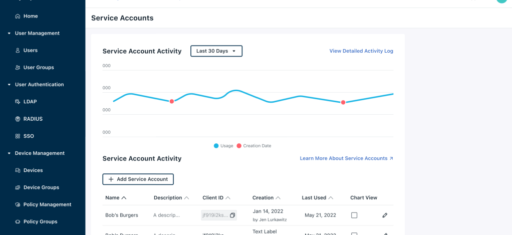
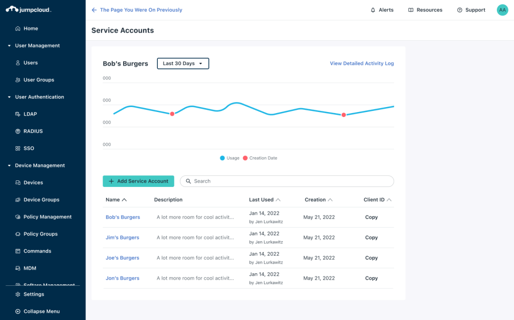
Key Iteration 2: Page Layout
This was our first attempt at moving away from a modal and into a full page, and I think it isn’t far off the mark.
The item list paired with the line graph works well visually and is highly useful and usable.
However, users still needed a way to manage accounts with ease.

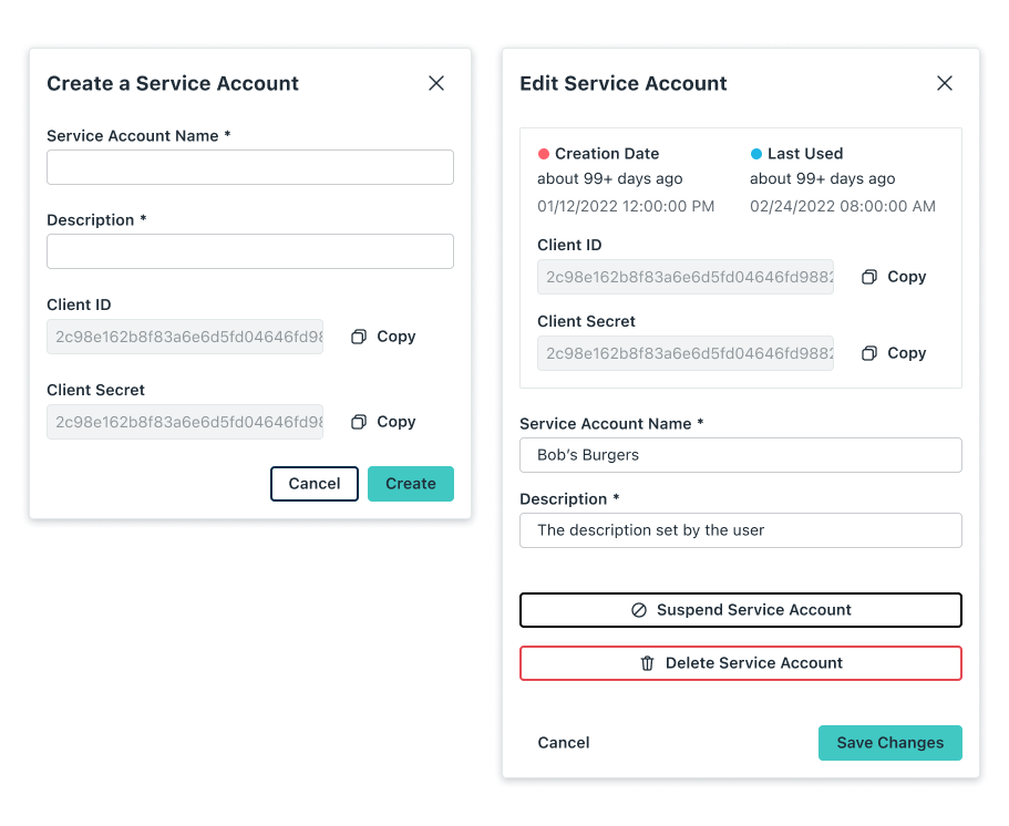
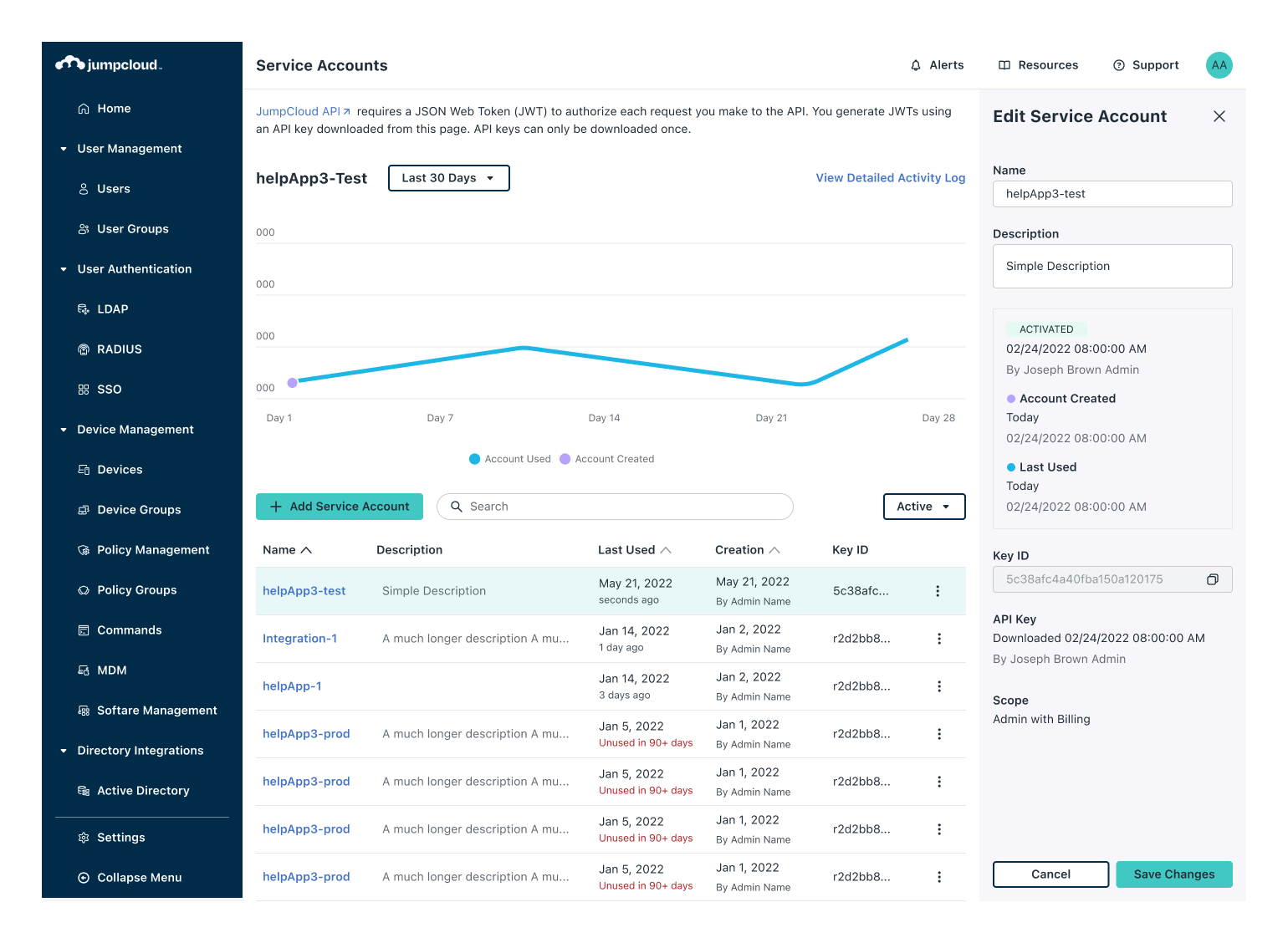
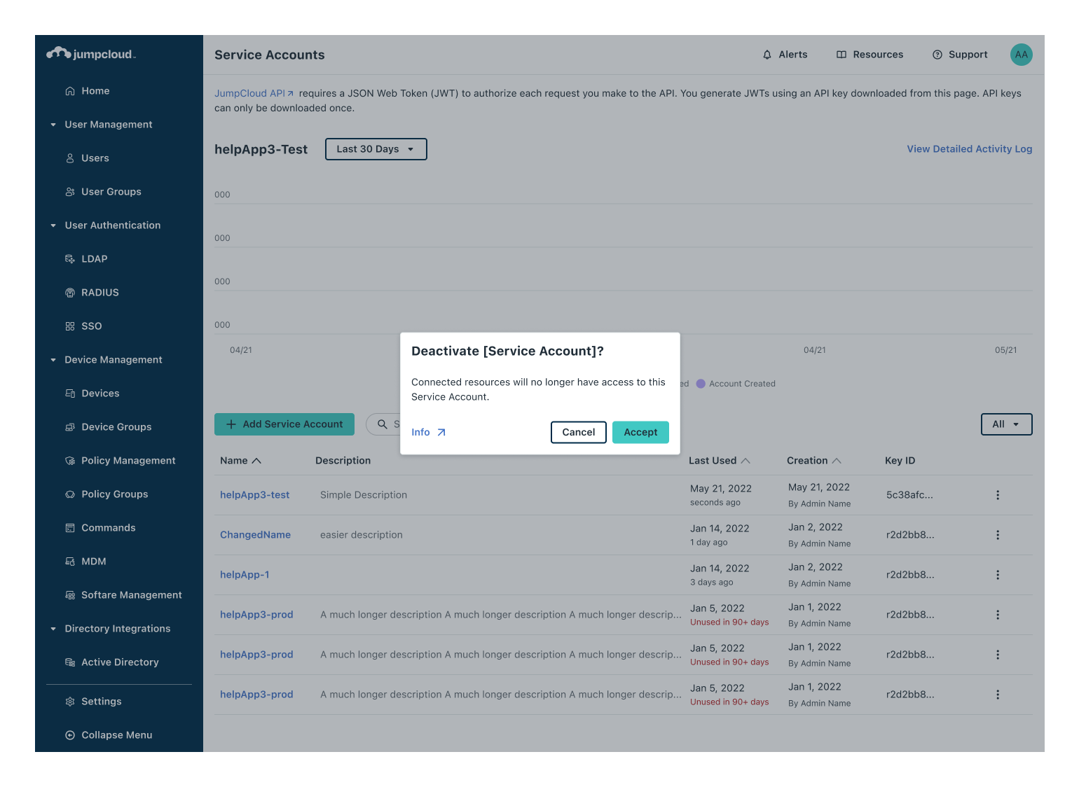
Key Iteration 3: Right Panel
A slide in right hand “edit” and “create” panel was scoped into the design in order to make these two tasks efficient and more discoverable.
The design here is close to our final design, meeting all acceptance criteria and passing stakeholder (UX, PM, and ENG) evaluation.
Delivery Phase
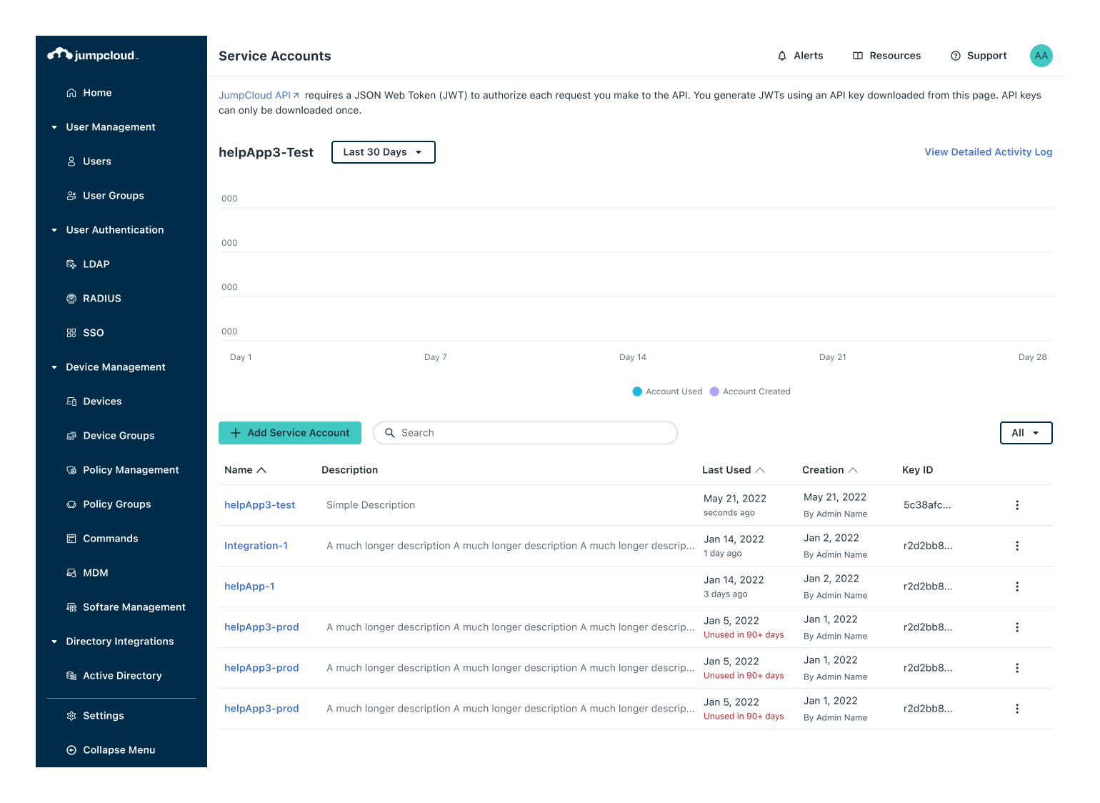

A high fidelity prototype to help uncover and communicate the nuances
I enjoy prototyping, so this is a “no-brainer” for me, but throughout this project I leaned into the use of design system components to help me jump past low fidelity. Ultimately this helps designers make screens that are closer to what the final screens will look and feel like.
On any larger project (in scope or impact), if you can do this high fidelity prototyping early, and still work efficiently- delivering on time- then I think it is well worth it.
See the development across to the finish line
I’m less inclined to do a proper handoff to engineering partners because I like to catch visual “bugs” as they come up. I think one of the benefits of having dedicated UX/UI within an organization is that they can regularly meet with engineers to dial in the details before new product ships. I find that this leads to a better final product with little added overhead. On top of that, these collaboration sessions are almost always one of my favorite parts of my job.

Leave a comment