
Making Login Easy
Safe and secure, but also easy 🎉
📌 About
Every user journey at Jumpcloud, regardless of persona, will start with login. We are all aware of how important first impressions are, so this portion of the experience for users must be frictionless, beautiful, familiar, and overall as user-friendly as possible.
On top of this, when dealing with login, it must be trusted and secure
Jumpcloud login architecture is safe and engineered for security, but was beginning to fall behind login-best-practices and really needed love on the front-end.
We also recognize login as platform wide patterns that would need to fit well in our design system
So, my team and I set out to discover a better way, along the way realizing that we could summarize what we were trying to accomplish with a simple logical phrase:
Let’s make login easy!
⚒️ METHODS
Initiate horizontal team meetings so that authentication, security, design system, and ux folks could get together regularly to review and contribute.
Competitive analysis of 4-8 indirect competitors. For this project, I crowd-sourced internal people’s opinions on which apps have the best login experience. This allowed for broadness, where I could identify common patterns
Crafted flowcharts to describe both back-end processes and user task flows.
Crafted low fidelity user journey flows to better communicate the requirements of the screen-to-screen user flow.
Gather and review data and metrics from customer feedback funnels built into our design processes.
High fidelity prototype delivered to authentication team as an artifact representing our “true north” for the future of login.
cATEGORy
Feature Improvement + Design System Design
Role/Company
Lead Designer, Jumpcloud
TAGS
design system design
ux design
product design
authentication
usability
security
branding
accessibility
Sample
Here is a video of the prototype I presented to the cross-functional team for review and to help us guide our login vision!
Discovery Phase
Rediscover login best practices and flows
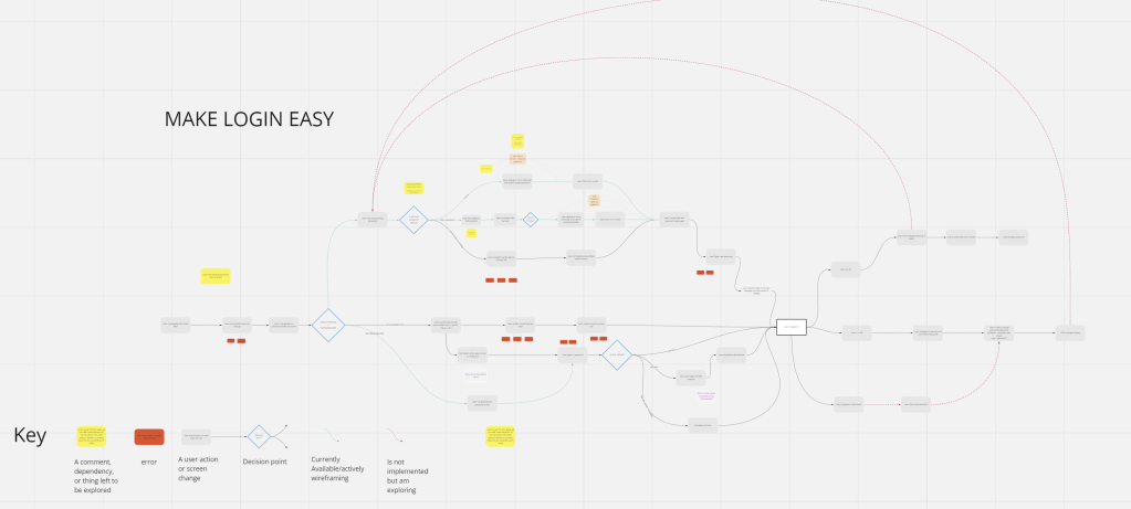
After competitive analysis, we took to the whiteboard and dove into step by step diagraming of the entire login workflow. This helped us:
- Identify security constraints at various phases of the user journey.
- Where we can reduce clicks, inefficiencies, and cognitive load.
- Where we could implement flexibility, improve recognition, and make system status more obvious.
- This helped us come together and share knowledge within the team.
- Component needs for the design system became clearly marked and I could start building those early.
Begin converging on screen-to-screen requirements
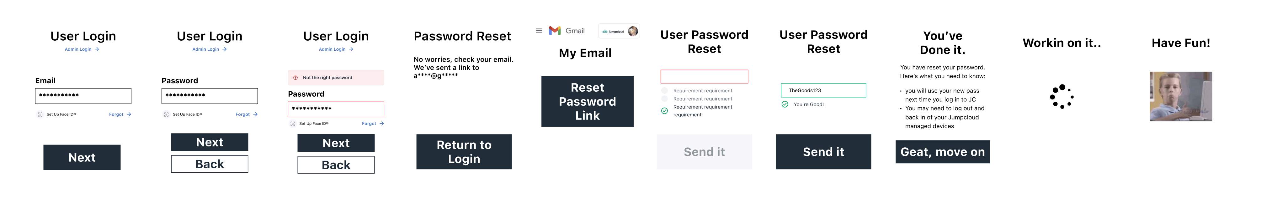
After building the flowchart above, I got a better sense of the user’s “happy” path and how we could start folding in best practices. From here, we needed to see screen flows.
These little 200×400 (ish) pixel frames help communicate generally what the new login screens would contain- text, buttons, inputs, options, etc.- and how these screens would connect together.
This was a simple prototype but helped as an intermediate step to get us thinking in the realm of screen requirements without going high fidelity.
Delivery Phase

Delivered on the team and project’s success criteria
Here’s a bit on what we landed on as success criteria and how we met those criteria:
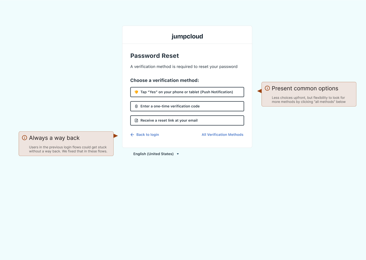
Reduce Friction in login:
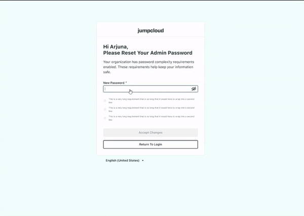
- Add improvement to show/hide passwords.
- Add improvement that allows users to see complexity requirements of new passwords when setting up accounts or resetting passwords (based on admin’s settings in Admin Portal).
- Ensure screens have appropriate flexibility in actions.
New authentication best-practices:
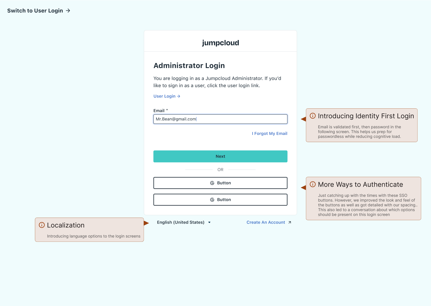
- Begin enabling passwordless login by splitting email screen from password screen
- User’s should have multiple options for MFA, added 2 options for MFA.
- User’s should be able to reset and change credentials securely and with ease, so we made revisions to the flows to make this more secure and less of a hassle.
Update visuals to represent changes in company branding.
- Implemented design system components
- Built new components for primary login modal and password complexity input fields.
Implemented from a platform standpoint using design system to help keep UX consistent
As a member of the Platform Experience team, I was able to lean into my strengths and build components of this experience as components in our Figma libraries.
We were able to get those implemented into storybook before development from our feature team started working to implement new login screens
The benefits of this approach are great. Not only does this make the design phase cleaner and final designs more maintainable for the team, but we also get improved consistency across our experiences and a shorter development time for engineers when using these components.

Leave a comment